Branding Beyond Buzzwords
In the crowded cannabis beverage market, standing out requires more than just catchy slogans and trendy packaging. Weed sodas that truly make a statement go beyond buzzwords and tap into deeper consumer desires.
Playing with Typography
Successful branding in this space hinges on a nuanced understanding of visual communication. Think carefully about the typography you use – it’s more than just choosing a font; it’s about conveying the essence of your brand through character, weight, and spacing.
A playful script font might evoke a sense of carefree indulgence, while bold sans-serif lettering could project energy and sophistication. Even subtle details like kerning (the space between letters) and leading (space between lines) can subtly influence how your brand is perceived.
Bold Color Choices
Color plays an equally powerful role in shaping perceptions. Ditch the predictable greens and purples that have become commonplace in cannabis branding. Embrace bold, unexpected color choices that reflect the unique personality of your sodas. A vibrant turquoise might suggest a refreshing, uplifting experience, while a deep crimson could hint at a more intense, decadent flavor profile.
Remember, color evokes emotions and associations. Use it strategically to create a distinct visual identity that resonates with your target audience and sets your weed sodas apart from the competition.
Unique Packaging Shapes and Sizes
Beyond typography and color, unique packaging shapes and sizes can make a significant impact. Consider unconventional designs that break free from the typical cylindrical soda can or bottle.
A geometric prism shape could convey modernity and sophistication, while a rounded, organic form might suggest a more natural, earthy feel. Experiment with materials as well – think frosted glass for an elegant touch or textured cardboard for a rustic vibe.
The right packaging not only houses your product but also becomes part of the overall branding experience. It’s an opportunity to create a memorable first impression and reinforce the unique personality of your weed sodas.
Subtle Signals of Substance
In the crowded cannabis beverage market, standing out requires more than just catchy slogans and trendy packaging. Weed sodas that truly make a statement go beyond buzzwords and tap into deeper consumer desires.
Successful branding in this space hinges on a nuanced understanding of visual communication. Think carefully about the typography you use – it’s more than just choosing a font; it’s about conveying the essence of your brand through character, weight, and spacing.
A playful script font might evoke a sense of carefree indulgence, while bold sans-serif lettering could project energy and sophistication. Even subtle details like kerning (the space between letters) and leading (space between lines) can subtly influence how your brand is perceived.
Color plays an equally powerful role in shaping perceptions. Ditch the predictable greens and purples that have become commonplace in cannabis branding. Embrace bold, unexpected color choices that reflect the unique personality of your sodas. A vibrant turquoise might suggest a refreshing, uplifting experience, while a deep crimson could hint at a more intense, decadent flavor profile.
Remember, color evokes emotions and associations. Use it strategically to create a distinct visual identity that resonates with your target audience and sets your weed sodas apart from the competition.
Beyond typography and color, unique packaging shapes and sizes can make a significant impact. Consider unconventional designs that break free from the typical cylindrical soda can or bottle.
A geometric prism shape could convey modernity and sophistication, while a rounded, organic form might suggest a more natural, earthy feel. Experiment with materials as well – think frosted glass for an elegant touch or textured cardboard for a rustic vibe.
The right packaging not only houses your product but also becomes part of the overall branding experience. It’s an opportunity to create a memorable first impression and reinforce the unique personality of your weed sodas.
Leaf Motifs and Botanical Illustrations
Subtle signals like leaf motifs, botanical illustrations, and the careful use of color can speak volumes about a weed soda brand without ever uttering a word.
A delicately illustrated fern or a stylized cannabis leaf woven into the design can instantly communicate a connection to nature and wellness, appealing to consumers who seek natural and holistic experiences.
Botanical illustrations can evoke feelings of tranquility, relaxation, and sophistication, elevating the brand beyond the typical “stoner” stereotype.
These visuals, when paired with earthy color palettes or unexpected pops of color inspired by flowers and foliage, create a visual language that resonates deeply with consumers seeking unique and meaningful experiences.
Nature-Inspired Hues
Subtle signals like leaf motifs, botanical illustrations, and the careful use of color can speak volumes about a weed soda brand without ever uttering a word.
A delicately illustrated fern or a stylized cannabis leaf woven into the design can instantly communicate a connection to nature and wellness, appealing to consumers who seek natural and holistic experiences.
Botanical illustrations can evoke feelings of tranquility, relaxation, and sophistication, elevating the brand beyond the typical “stoner” stereotype.
These visuals, when paired with earthy color palettes or unexpected pops of color inspired by flowers and foliage, create a visual language that resonates deeply with consumers seeking unique and meaningful experiences.
Transparency as a Statement of Quality
In the crowded cannabis beverage market, standing out requires more than just catchy slogans and trendy packaging. Weed sodas that truly make a statement go beyond buzzwords and tap into deeper consumer desires.
Successful branding in this space hinges on a nuanced understanding of visual communication. Think carefully about the typography you use – it’s more than just choosing a font; it’s about conveying the essence of your brand through character, weight, and spacing.
A playful script font might evoke a sense of carefree indulgence, while bold sans-serif lettering could project energy and sophistication. Even subtle details like kerning (the space between letters) and leading (space between lines) can subtly influence how your brand is perceived.
Color plays an equally powerful role in shaping perceptions. Ditch the predictable greens and purples that have become commonplace in cannabis branding. Embrace bold, unexpected color choices that reflect the unique personality of your sodas. A vibrant turquoise might suggest a refreshing, uplifting experience, while a deep crimson could hint at a more intense, decadent flavor profile.
Remember, color evokes emotions and associations. Use it strategically to create a distinct visual identity that resonates with your target audience and sets your weed sodas apart from the competition.
Beyond typography and color, unique packaging shapes and sizes can make a significant impact. Consider unconventional designs that break free from the typical cylindrical soda can or bottle.
A geometric prism shape could convey modernity and sophistication, while a rounded, organic form might suggest a more natural, earthy feel. Experiment with materials as well – think frosted glass for an elegant touch or textured cardboard for a rustic vibe.
The right packaging not only houses your product but also becomes part of the overall branding experience. It’s an opportunity to create a memorable first impression and reinforce the unique personality of your weed sodas.
Subtle signals like leaf motifs, botanical illustrations, and the careful use of color can speak volumes about a weed soda brand without ever uttering a word.
A delicately illustrated fern or a stylized cannabis leaf woven into the design can instantly communicate a connection to nature and wellness, appealing to consumers who seek natural and holistic experiences.
Botanical illustrations can evoke feelings of tranquility, relaxation, and sophistication, elevating the brand beyond the typical “stoner” stereotype.
These visuals, when paired with earthy color palettes or unexpected pops of color inspired by flowers and foliage, create a visual language that resonates deeply with consumers seeking unique and meaningful experiences.
Transparency in ingredients, sourcing, and production processes is another powerful statement about quality. Consumers are increasingly demanding transparency from brands, especially in the cannabis industry, where trust and authenticity are paramount.
Clearly labeling ingredients, highlighting ethical sourcing practices, and sharing information about your manufacturing process builds credibility and fosters a stronger connection with consumers who value these principles.
By making a commitment to transparency, weed soda brands can demonstrate their dedication to quality, sustainability, and consumer well-being.
Targeting a Specific Vibe
In the crowded cannabis beverage market, standing out requires more than just catchy slogans and trendy packaging. Weed sodas that truly make a statement go beyond buzzwords and tap into deeper consumer desires.
Successful branding in this space hinges on a nuanced understanding of visual communication. Think carefully about the typography you use – it’s more than just choosing a font; it’s about conveying the essence of your brand through character, weight, and spacing.
A playful script font might evoke a sense of carefree indulgence, while bold sans-serif lettering could project energy and sophistication. Even subtle details like kerning (the space between letters) and leading (space between lines) can subtly influence how your brand is perceived.
Color plays an equally powerful role in shaping perceptions. Ditch the predictable greens and purples that have become commonplace in cannabis branding. Embrace bold, unexpected color choices that reflect the unique personality of your sodas. A vibrant turquoise might suggest a refreshing, uplifting experience, while a deep crimson could hint at a more intense, decadent flavor profile.
Remember, color evokes emotions and associations. Use it strategically to create a distinct visual identity that resonates with your target audience and sets your weed sodas apart from the competition.
Beyond typography and color, unique packaging shapes and sizes can make a significant impact. Consider unconventional designs that break free from the typical cylindrical soda can or bottle.
A geometric prism shape could convey modernity and sophistication, while a rounded, organic form might suggest a more natural, earthy feel. Experiment with materials as well – think frosted glass for an elegant touch or textured cardboard for a rustic vibe.
The right packaging not only houses your product but also becomes part of the overall branding experience. It’s an opportunity to create a memorable first impression and reinforce the unique personality of your weed sodas.
Subtle signals like leaf motifs, botanical illustrations, and the careful use of color can speak volumes about a weed soda brand without ever uttering a word.
A delicately illustrated fern or a stylized cannabis leaf woven into the design can instantly communicate a connection to nature and wellness, appealing to consumers who seek natural and holistic experiences.
Botanical illustrations can evoke feelings of tranquility, relaxation, and sophistication, elevating the brand beyond the typical “stoner” stereotype.
These visuals, when paired with earthy color palettes or unexpected pops of color inspired by flowers and foliage, create a visual language that resonates deeply with consumers seeking unique and meaningful experiences.
Transparency in ingredients, sourcing, and production processes is another powerful statement about quality. Consumers are increasingly demanding transparency from brands, especially in the cannabis industry, where trust and authenticity are paramount.
Clearly labeling ingredients, highlighting ethical sourcing practices, and sharing information about your manufacturing process builds credibility and fosters a stronger connection with consumers who value these principles.
By making a commitment to transparency, weed soda brands can demonstrate their dedication to quality, sustainability, and consumer well-being.
Sophisticated and Minimalist Design
In the crowded cannabis beverage market, standing out requires more than just catchy slogans and trendy packaging. Weed sodas that truly make a statement go beyond buzzwords and tap into deeper consumer desires.
Successful branding in this space hinges on a nuanced understanding of visual communication. Think carefully about the typography you use – it’s more than just choosing a font; it’s about conveying the essence of your brand through character, weight, and spacing.
A playful script font might evoke a sense of carefree indulgence, while bold sans-serif lettering could project energy and sophistication. Even subtle details like kerning (the space between letters) and leading (space between lines) can subtly influence how your brand is perceived.
Color plays an equally powerful role in shaping perceptions. Ditch the predictable greens and purples that have become commonplace in cannabis branding. Embrace bold, unexpected color choices that reflect the unique personality of your sodas. A vibrant turquoise might suggest a refreshing, uplifting experience, while a deep crimson could hint at a more intense, decadent flavor profile.
Remember, color evokes emotions and associations. Use it strategically to create a distinct visual identity that resonates with your target audience and sets your weed sodas apart from the competition.
Beyond typography and color, unique packaging shapes and sizes can make a significant impact. Consider unconventional designs that break free from the typical cylindrical soda can or bottle.
A geometric prism shape could convey modernity and sophistication, while a rounded, organic form might suggest a more natural, earthy feel. Experiment with materials as well – think frosted glass for an elegant touch or textured cardboard for a rustic vibe.
The right packaging not only houses your product but also becomes part of the overall branding experience. It’s an opportunity to create a memorable first impression and reinforce the unique personality of your weed sodas.
Subtle signals like leaf motifs, botanical illustrations, and the careful use of color can speak volumes about a weed soda brand without ever uttering a word.
A delicately illustrated fern or a stylized cannabis leaf woven into the design can instantly communicate a connection to nature and wellness, appealing to consumers who seek natural and holistic experiences.
Botanical illustrations can evoke feelings of tranquility, relaxation, and sophistication, elevating the brand beyond the typical “stoner” stereotype.
These visuals, when paired with earthy color palettes or unexpected pops of color inspired by flowers and foliage, create a visual language that resonates deeply with consumers seeking unique and meaningful experiences.
Fun and Playful Aesthetics
Targeting a specific vibe, especially one as playful and fun as cannabis-infused sodas should involve a holistic approach to branding.
It’s about crafting an experience, not just a product.
Start by imagining your ideal customer: who are they, what do they value, and what kind of atmosphere do they gravitate towards? Are they adventurous and outdoorsy? Chic and sophisticated? Relaxed and nostalgic? Let this vision guide every design choice.
Typography plays a crucial role in setting the tone. A whimsical script font can evoke a carefree, celebratory mood, while bold sans-serif fonts might convey energy and modernity. Don’t be afraid to experiment with unexpected pairings and creative layouts to make your brand truly stand out.
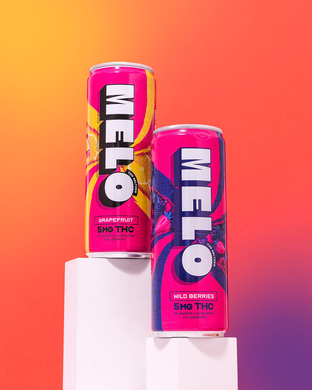
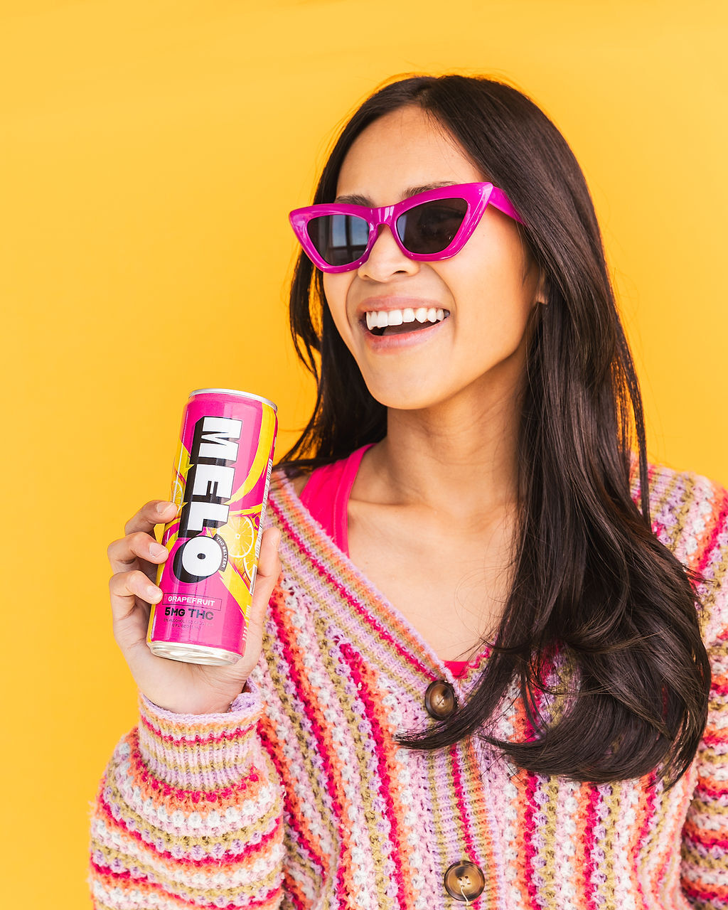
Color is another powerful tool for conveying personality. While traditional cannabis colors like green and purple are familiar, they can also feel predictable. Think outside the box! Vibrant blues, sunny yellows, or even a deep magenta can create a more unique and memorable impression.
Packaging design should be just as playful and engaging as your brand identity. Consider unconventional shapes that break free from the typical soda can or bottle. A rounded, organic form might suggest a natural, refreshing experience, while geometric shapes could convey modernity and sophistication. Don’t forget about materials! Textured cardboard, frosted glass, or even metallic finishes can add tactile interest and elevate your brand.
Rustic and Earthy Appeal
Targeting a specific vibe, especially one as playful and fun as cannabis-infused sodas should involve a holistic approach to branding.
It’s about crafting an experience, not just a product.
Start by imagining your ideal customer: who are they, what do they value, and what kind of atmosphere do they gravitate towards? Are they adventurous and outdoorsy? Chic and sophisticated? Relaxed and nostalgic? Let this vision guide every design choice.
Typography plays a crucial role in setting the tone. A whimsical script font can evoke a carefree, celebratory mood, while bold sans-serif fonts might convey energy and modernity. Don’t be afraid to experiment with unexpected pairings and creative layouts to make your brand truly stand out.
Color is another powerful tool for conveying personality. While traditional cannabis colors like green and purple are familiar, they can also feel predictable. Think outside the box! Vibrant blues, sunny yellows, or even a deep magenta can create a more unique and memorable impression.
Packaging design should be just as playful and engaging as your brand identity. Consider unconventional shapes that break free from the typical soda can or bottle. A rounded, organic form might suggest a natural, refreshing experience, while geometric shapes could convey modernity and sophistication. Don’t forget about materials! Textured cardboard, frosted glass, or even metallic finishes can add tactile interest and elevate your brand.
Taste the clean and crisp flavors of Melo Seltzer THC drinks
Line the Studio
Lipton Sunday
- Why Ghosting Has Become Such A Prevalent Issue In Modern Dating - June 4, 2025
- Where To Inject Botox For Nasal Flare? - June 2, 2025
- The Pansexual Experience: Love, Desire, And Attraction Beyond Gender - June 1, 2025